Title:
Project Details:
Description:
Role: Typeface Design, Branding
Poster Design
Tools: Figma, Illustrator, Glyphs, Photoshop
Team: Sakura Chino, Vera Drapers, Ashten Alexander
Poster Design
Tools: Figma, Illustrator, Glyphs, Photoshop
Team: Sakura Chino, Vera Drapers, Ashten Alexander
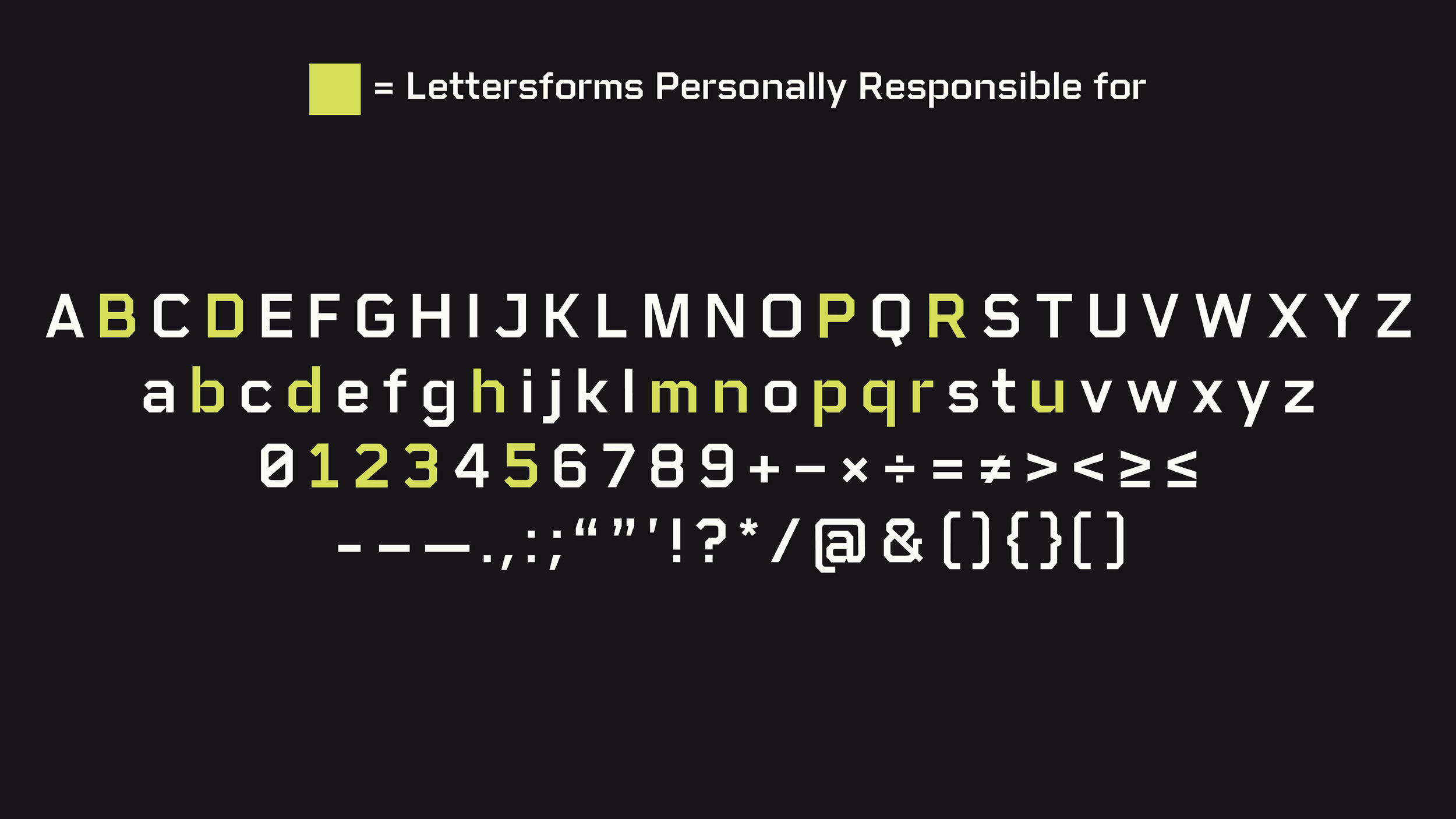
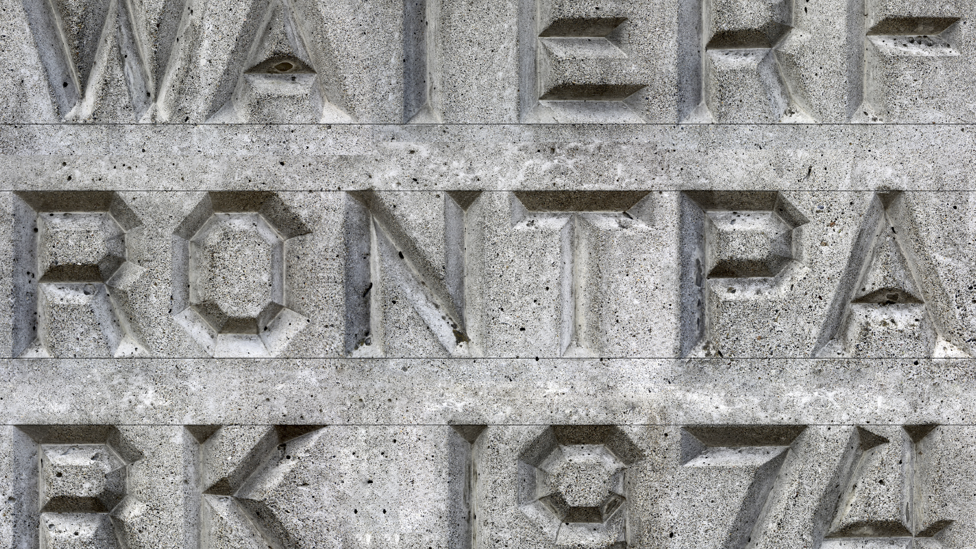
Derived from a concrete-cast waterfront sign within Seattle, Breuer Sans is a modular typeface that honors architect Marcel Breuer's legacy. Reflecting the sturdy geometry of 1950s Brutalist architecture, this three-weight typeface impeccably captures the distinctive features of the original sign. Breuer Sans reinterprets history with a contemporary twist, encapsulating the spirit of an audacious design epoch that still ignites inspiration today. Elevate your projects with a touch of enduring architectural grandeur.
Characters Set:
Design Process:
Typographic Form & Fusion
The Breuer Sans modular typeface combines Seattle's concrete waterfront sign and Marcel Breuer's Brutalist architectural style to create a modern typography. This involved deep research, deconstructing the sign's geometric complexities into modular elements influenced by 1950s Brutalist architecture. Through iterative design, Breuer Sans merges historical authenticity and contemporary innovation, bridging the gap between Breuer's legacy and modern design principles while embodying architectural elegance and a contemporary aesthetic.
The Breuer Sans modular typeface combines Seattle's concrete waterfront sign and Marcel Breuer's Brutalist architectural style to create a modern typography. This involved deep research, deconstructing the sign's geometric complexities into modular elements influenced by 1950s Brutalist architecture. Through iterative design, Breuer Sans merges historical authenticity and contemporary innovation, bridging the gap between Breuer's legacy and modern design principles while embodying architectural elegance and a contemporary aesthetic.

Crafting Architectural Grandeur
The process started with rough sketches, laying the foundation for a comprehensive letterform system that eventually became a standardized framework, ensuring project cohesion. Using digital tools like Adobe Illustrator, each letterform was meticulously refined to capture the essence of Breuer Sans. The transition to glyphs marked the peak of this digitization process, faithfully preserving the original sign's character in the digital typeface. This journey culminated in a poster that not only showcased but celebrated the harmony of form and function within Breuer Sans, embodying architectural splendor that continues to inspire contemporary design.
The process started with rough sketches, laying the foundation for a comprehensive letterform system that eventually became a standardized framework, ensuring project cohesion. Using digital tools like Adobe Illustrator, each letterform was meticulously refined to capture the essence of Breuer Sans. The transition to glyphs marked the peak of this digitization process, faithfully preserving the original sign's character in the digital typeface. This journey culminated in a poster that not only showcased but celebrated the harmony of form and function within Breuer Sans, embodying architectural splendor that continues to inspire contemporary design.
Breuer Sans: